Vendor Booth Ideas and Tips
Fall of 2012 marked our first experience as an art vendor, at Cooper Young Festival in Memphis, TN. Over the years, we’ve padded our resume with quite a few more shows and experimented with a LOT of trial and error on our vendor booth layout and setup. We’ve learned a lot, both from our own experiences and from looking to other vendors for inspiration.
Today, we’re going to share with you our top 16 ideas for selling at art festivals, craft fairs and indie markets. These tips can be summed up into three key categories: Booth Display, Signage/Décor and—the most important—Branding.
FIRST, LET'S DIVE INTO VENDOR BOOTH DISPLAY.
1. Plan out your booth space BEFORE the day of your festival.
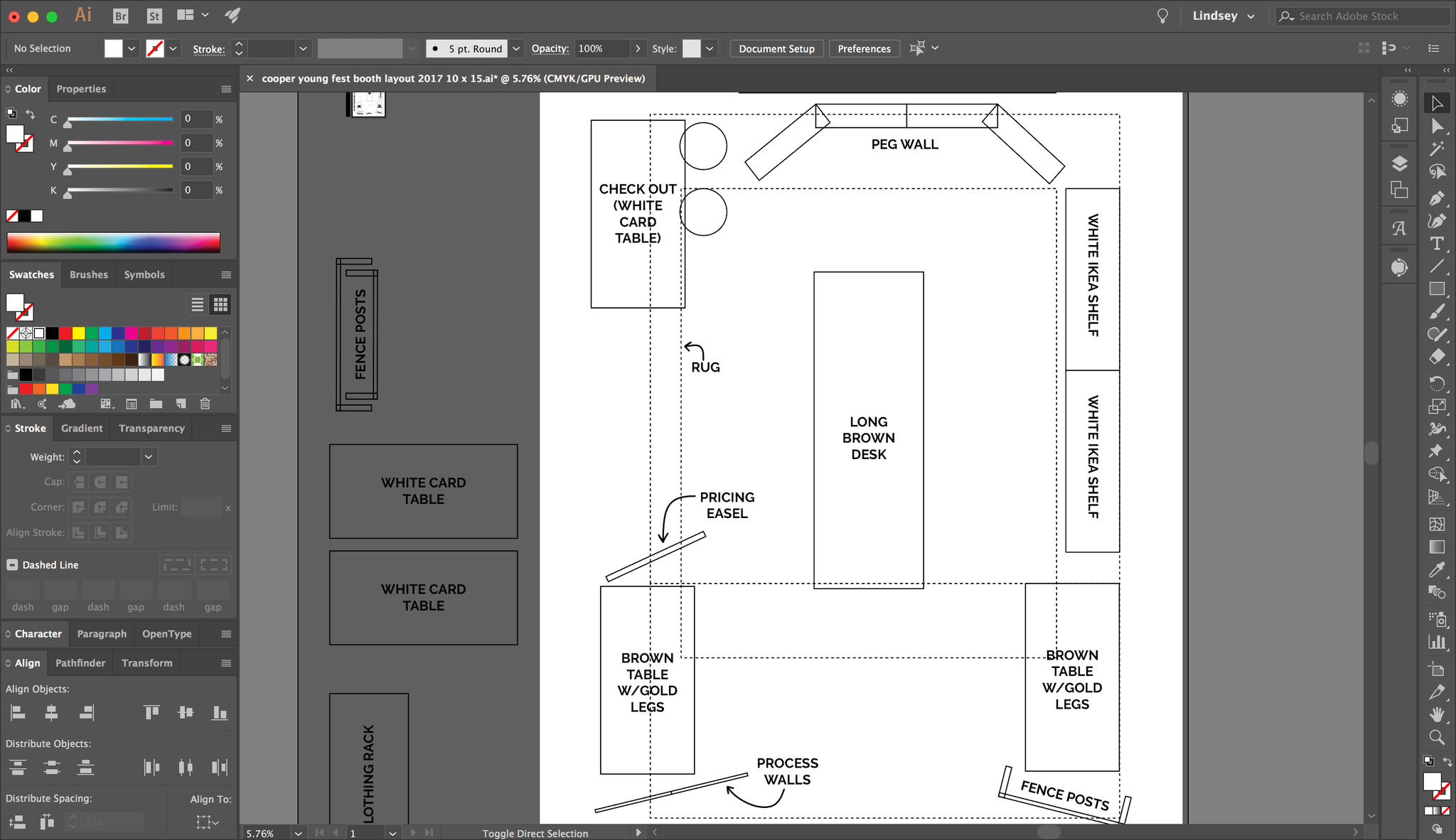
Before we set foot at an art festival, our vendor booth is completely laid out. We measure all our display pieces (shelves, tables, etc.) and configure the space to help speed up the set up time. Plus, not all shows have the same options for booth sizes (because that would just be too easy). This year, our Cooper Young booth featured a 10’ x 15’ space, while some of our holiday shows ranged from a 6’ x 8’ space to a 10’ x 20’ double booth. It helps to lay everything out beforehand to know what will or will not fit in the allotted space. Once everything is measured, we use Adobe Illustrator to plan out the booth space, with everything to scale. We print out copies to take with us during set up, as well as email a copy to ourselves in case we lose the paper copies (it happens).
Here's a look at my Adobe Illustrator artboard for our most recent Cooper Young Festival vendor booth:
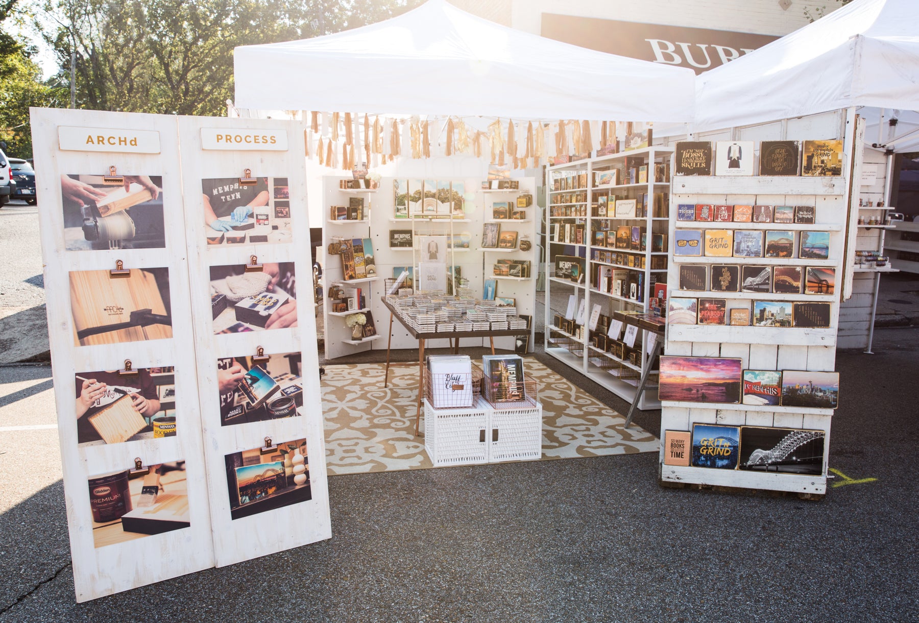
And here is our finished vendor booth, based on that original mock up:
2. Display vertically.
When potential buyers pass your vendor booth, they’re not seeing product that is flat on tables. At least some of your work needs to be in their line of sight.
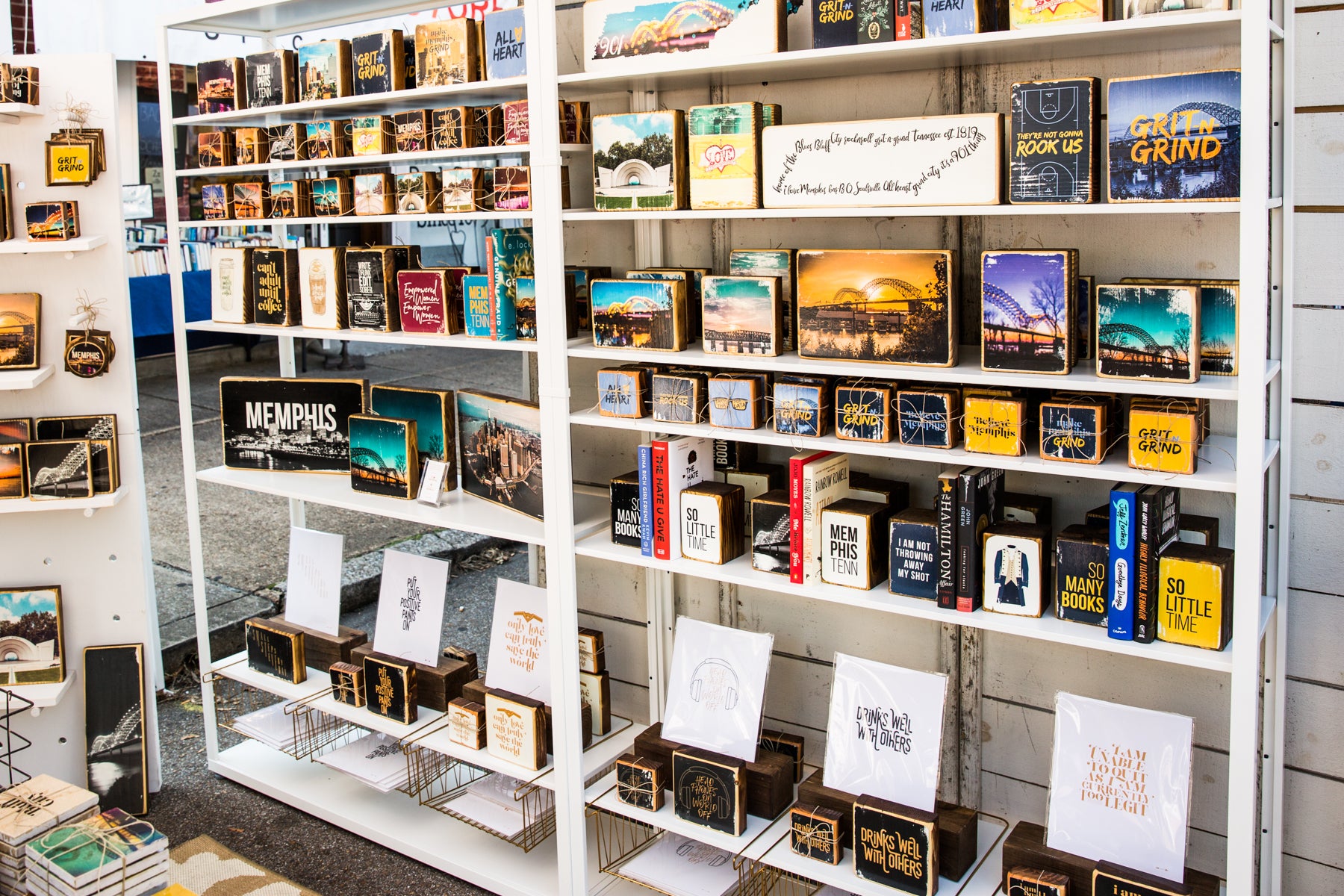
One way we add height to our booth display is with these adjustable white metal shelf units we found at IKEA (shop them here). The shelves are completely adjustable and IKEA sells individual shelves, so you can add to the original four included. We switch it up depending on what art we need to display at each festival or market.
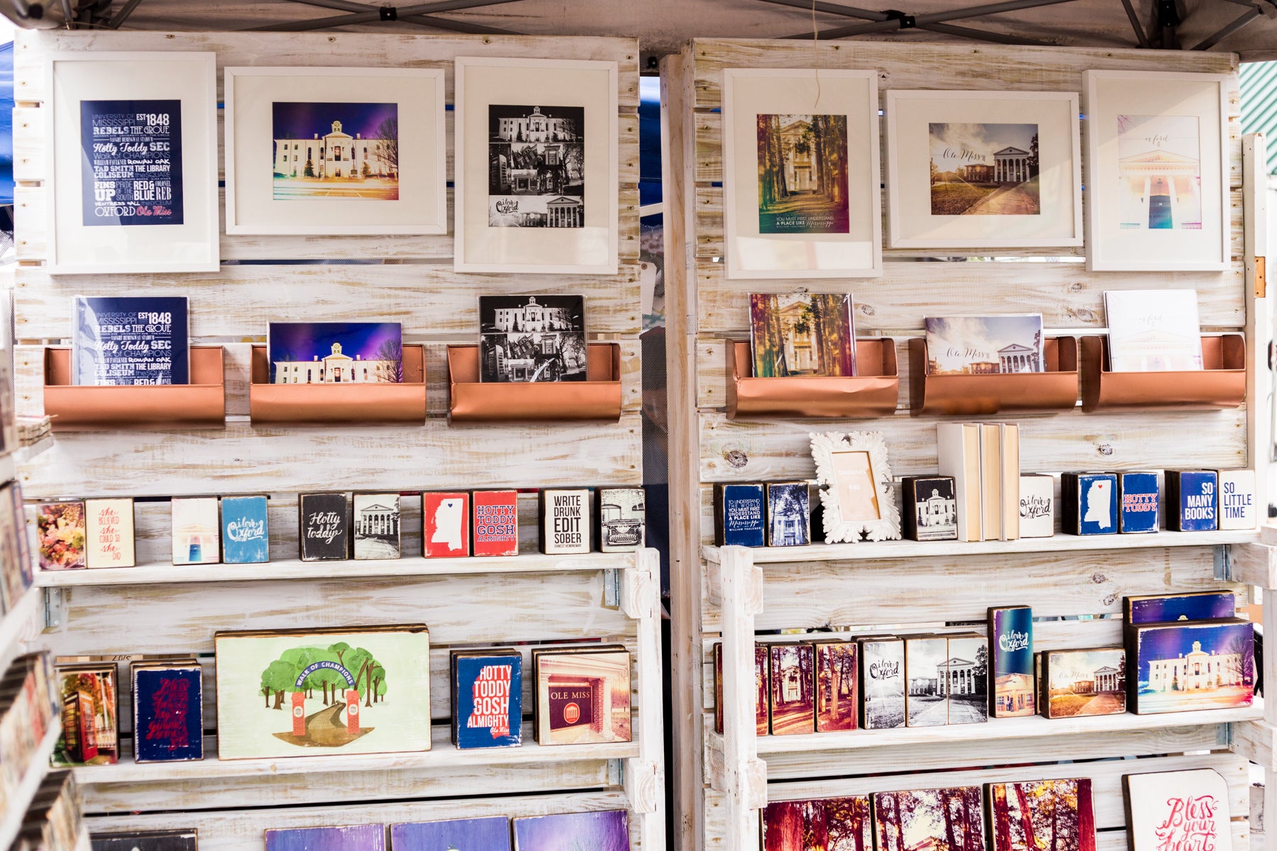
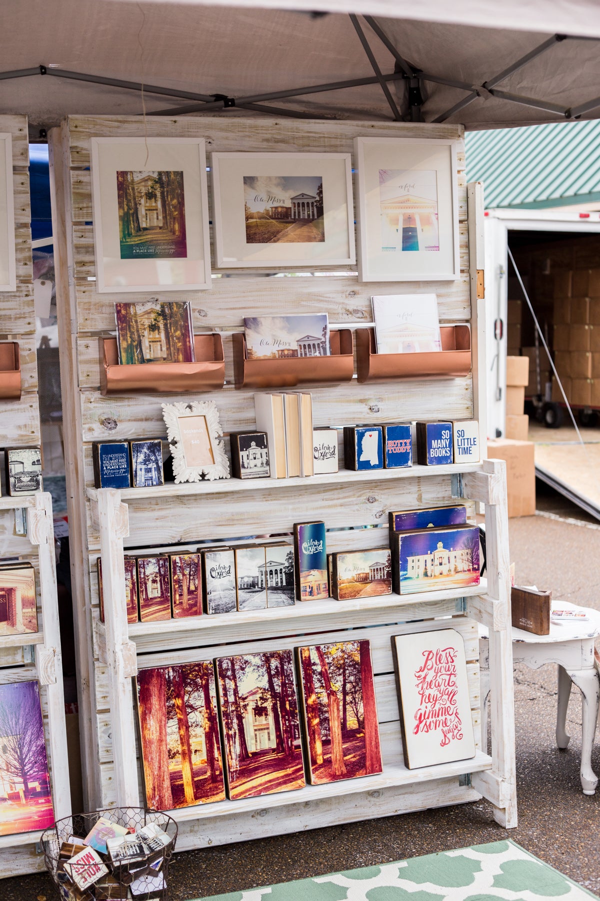
In the past, we've used these custom built white-washed wood displays on rollers, which our brother built for us. We love how they look in our booth, as they mimic a more retail-style setting. However, these are rather heavy and bulky to transport.
Looking for something a little more transport friendly, this year we commissioned a custom white wood peg wall. The unit breaks down into four separate pieces, so it's easy and convenient for traveling. Everything hooks together via large bolts and wing nuts, with the shelves and pegs packed separately. It's also completely adjustable, as the pegs can be configured in various ways. This wall unit is great for displaying our larger 5 panel wood pieces, which serve as great eye catchers for potential buyers walking by our vendor booth.
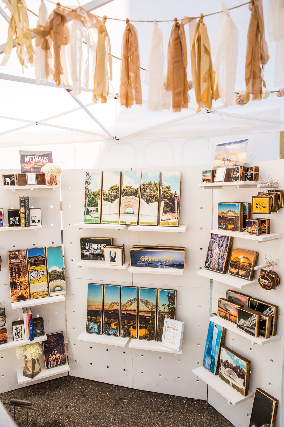
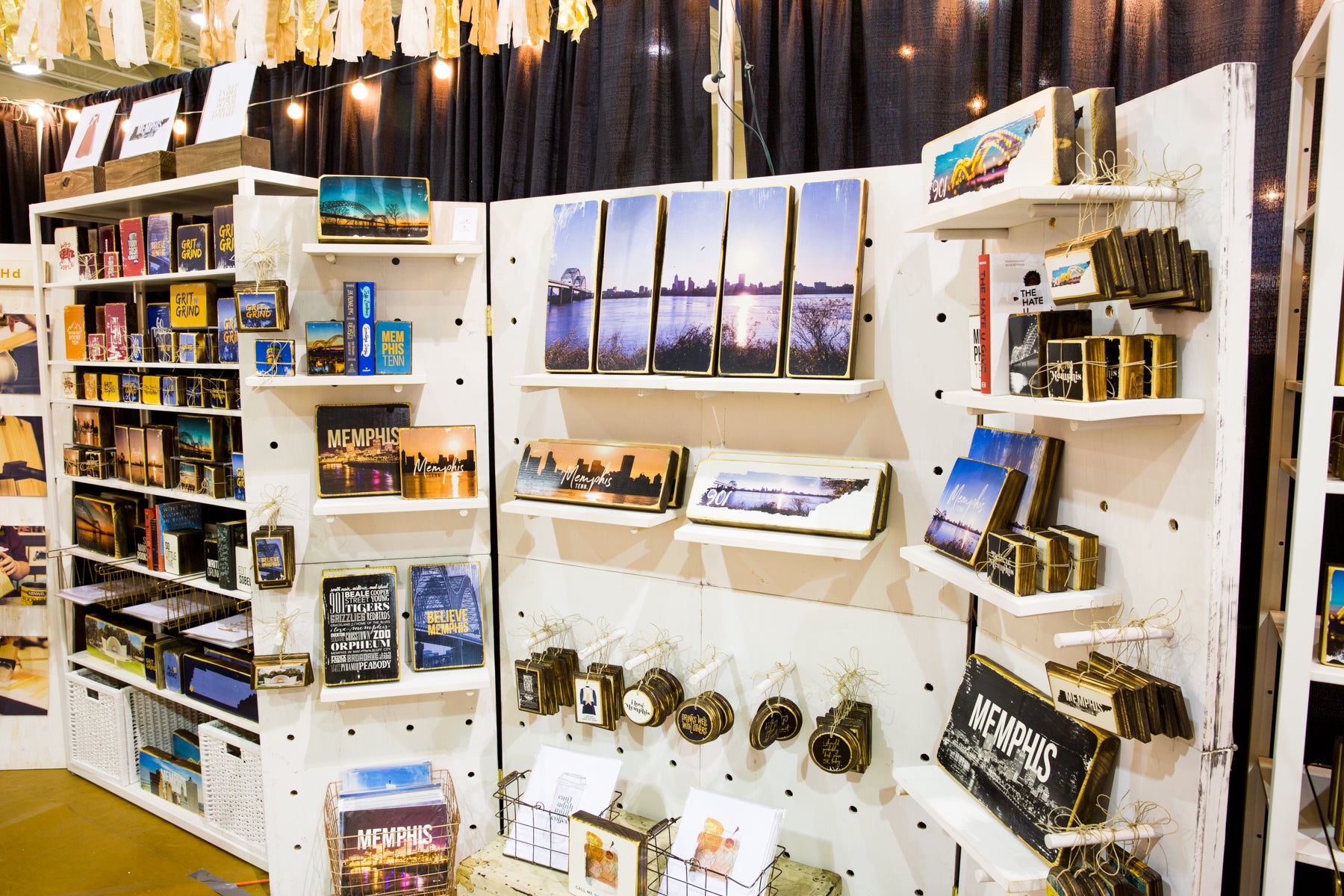
For smaller shows, we take just two of the four wall panels, usually paired with one of the white IKEA shelf units. Bonus: extra pegs are great for hanging ornaments!
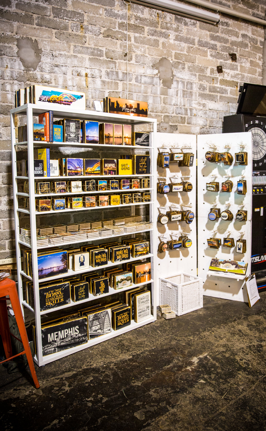
Clear acrylic risers are also a great way to subtly add height and levels when displaying artwork on a table. Because they're clear, they don't take away from your displayed art. We use combinations of this 5 piece set from Displays2Go.
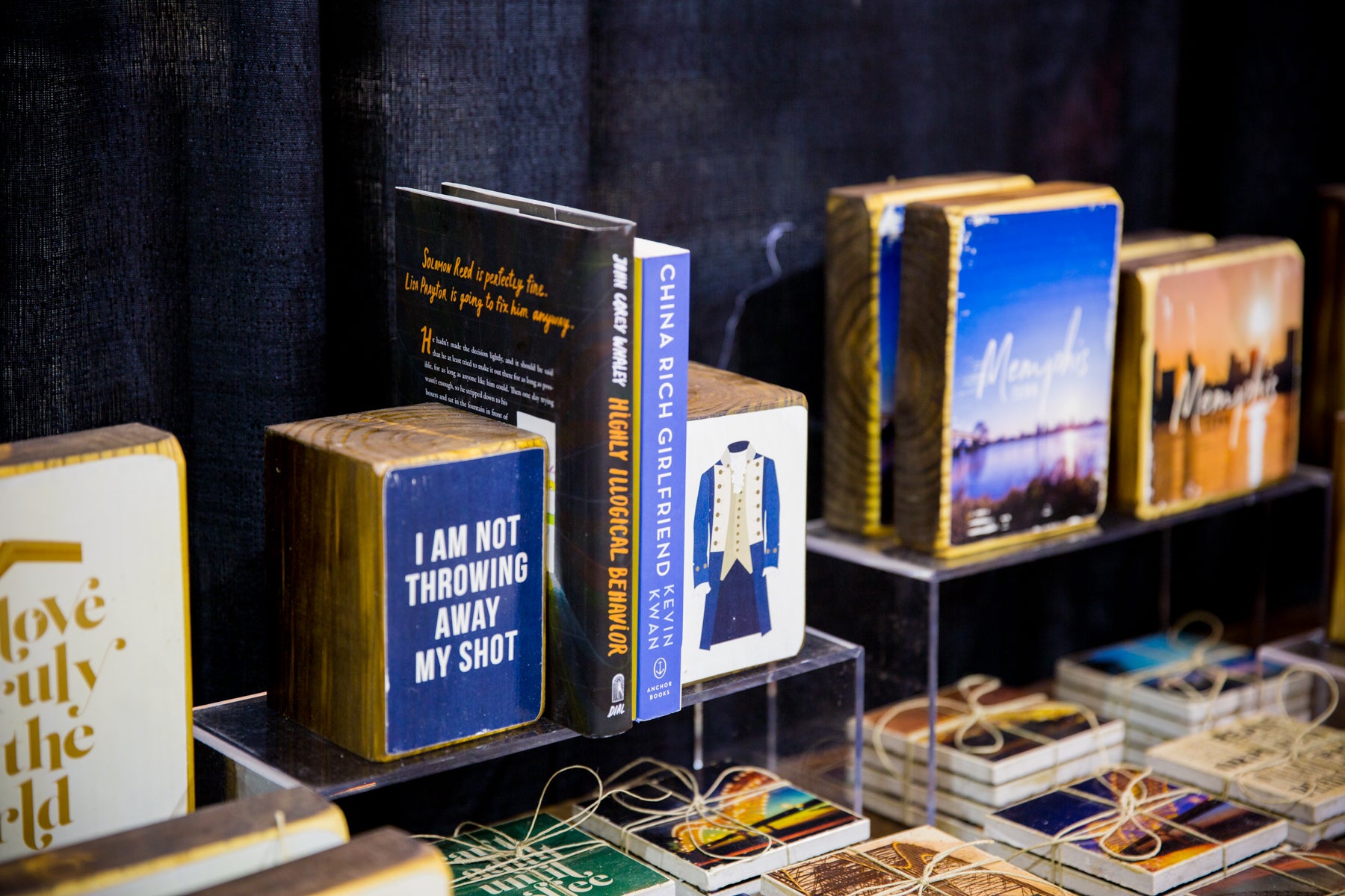
3. Choose display colors that will make your work pop.
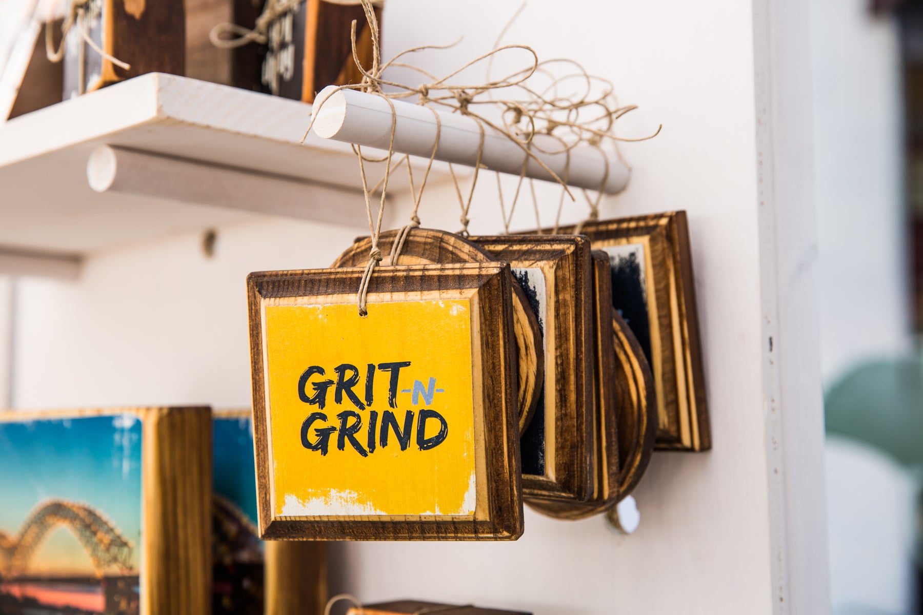
As you can see, for our larger display pieces (shelves, walls), we incorporate as much white as possible. Because all sides of our wood art is stained in a dark finish, the white background helps it pop. We also prefer how clean the white and neutral hues look.
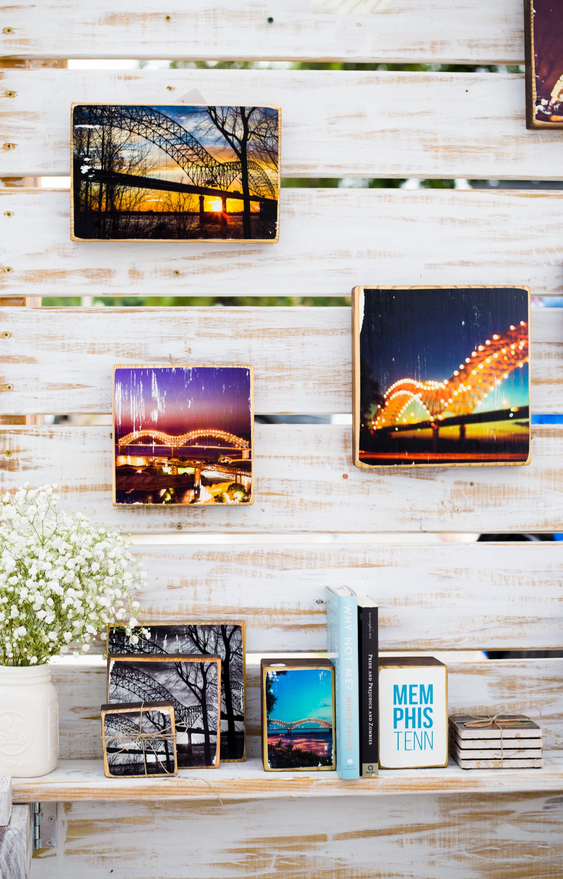
4. Store and display multiple art prints.
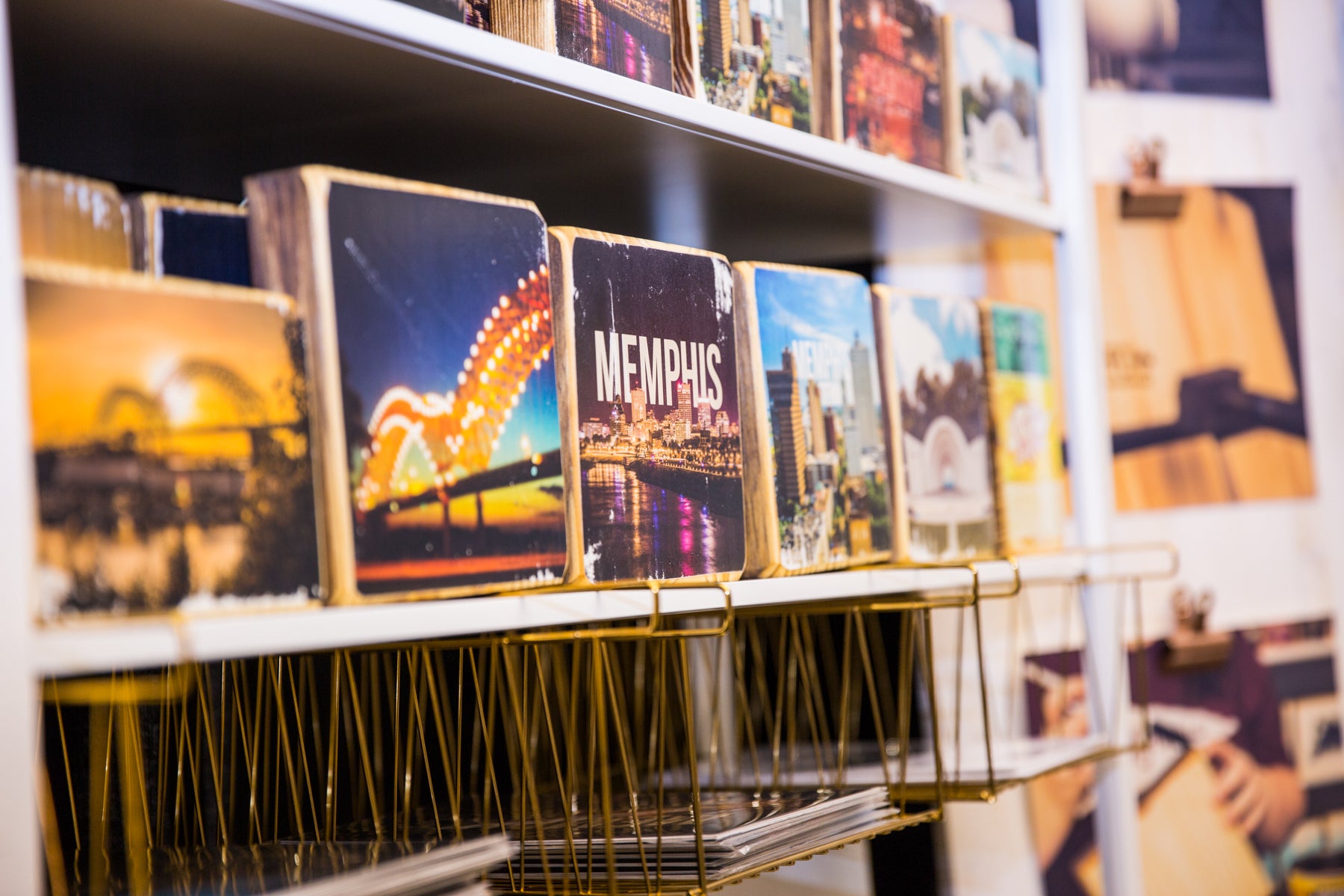
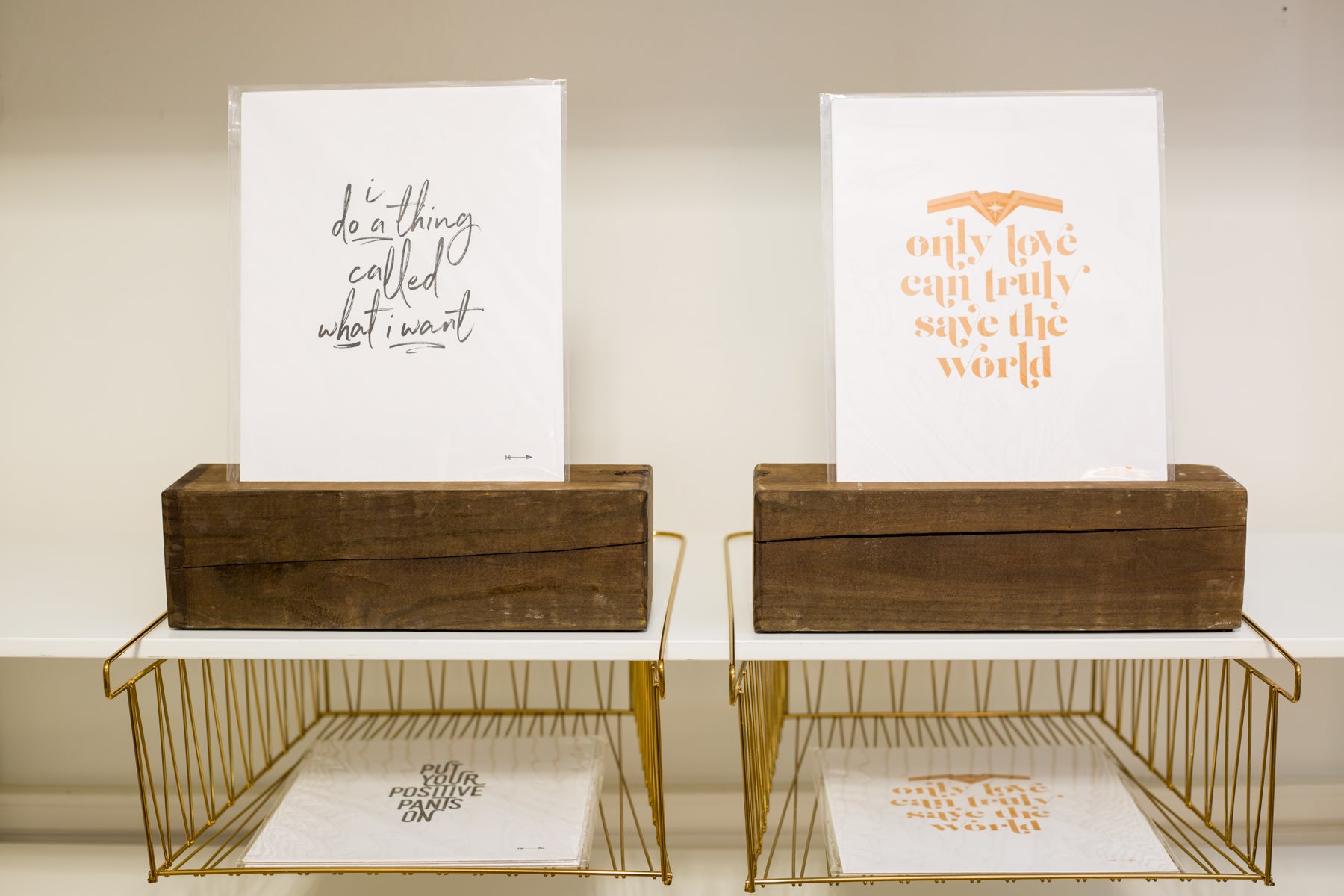
We have ALL-CAPS-STRUGGLED with how to display and store our art prints, other than stuffing them in baskets for browsing. We recently discovered these gold wire baskets from IKEA that slide on perfectly to our white IKEA shelves. They are great at storing stacks of prints!
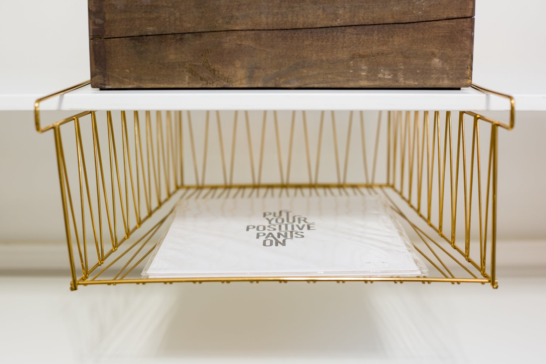
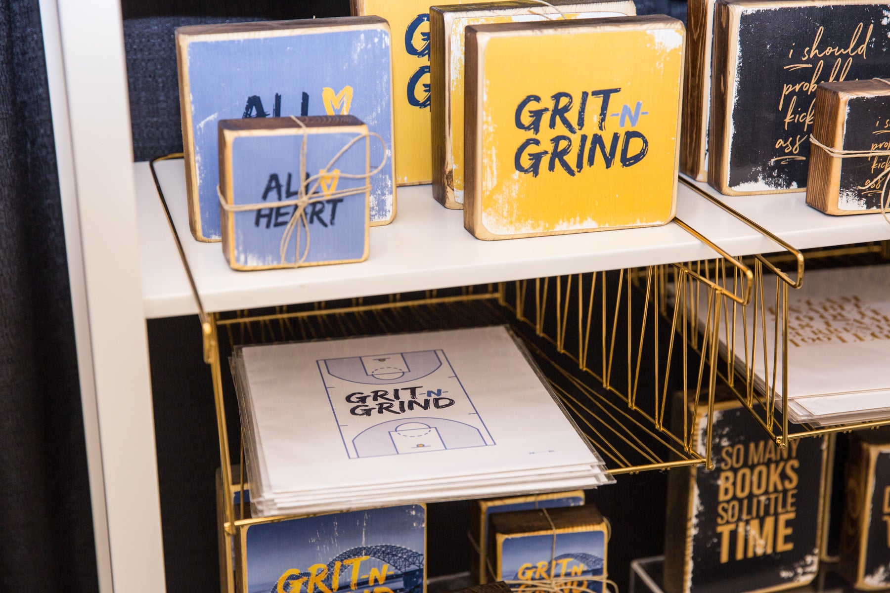
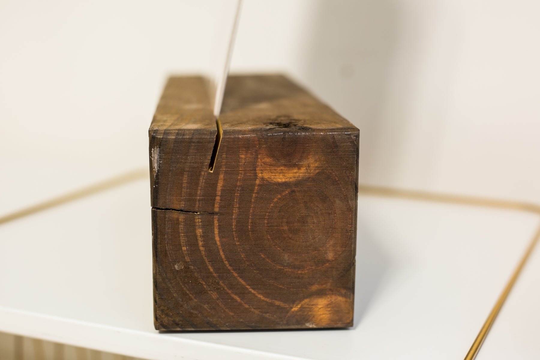
To actually display the prints, we chopped up a 4” x 4” piece of lumber and sawed angled grooves down the top. We stained them to match the color of our wood art. The art prints stand up perfectly in the grooves of the wood, which we then prop up above the wire baskets. It’s easy for buyers to see the print displayed and simply pick it up from the basket underneath for purchase.

5. Use slim Christmas trees to display holiday ornaments.
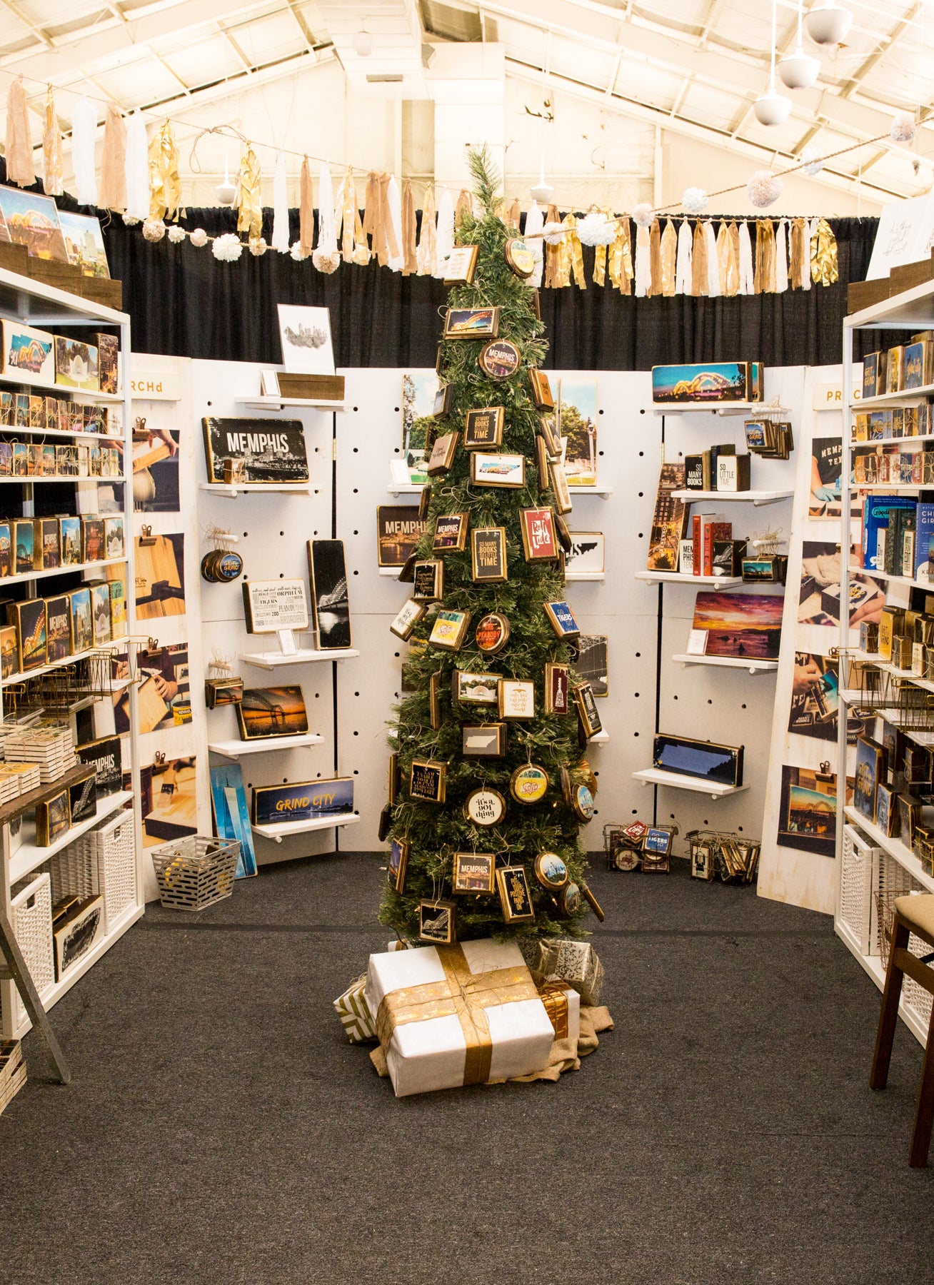
During our holiday shows, our Christmas ornaments are HUGE sellers. While we use our peg wall for some ornament overflow, ornaments look best hanging on an actual Christmas tree. This also better demonstrates to potential buyers how it will look on their own tree. However, for those smaller booth spaces, a full Christmas tree takes up too much valuable real estate and just isn't practical. And some of the smaller, table-top trees aren’t known for being sturdy. Because our ornaments are on the heavier side, we've had issues with the smaller trees tipping over ... especially when buyers are trying to take the ornaments off the trees to purchase. We found a great slim Christmas tree from our local At Home. It measures only 18” in diameter but can still can hold quite a few ornaments. We re-stock throughout the show to keep the tree looking full.
NEXT UP, WE HAVE BOOTH SIGNAGE/DÉCOR.
6. Emphasize your business name for potential buyers with branded signage.
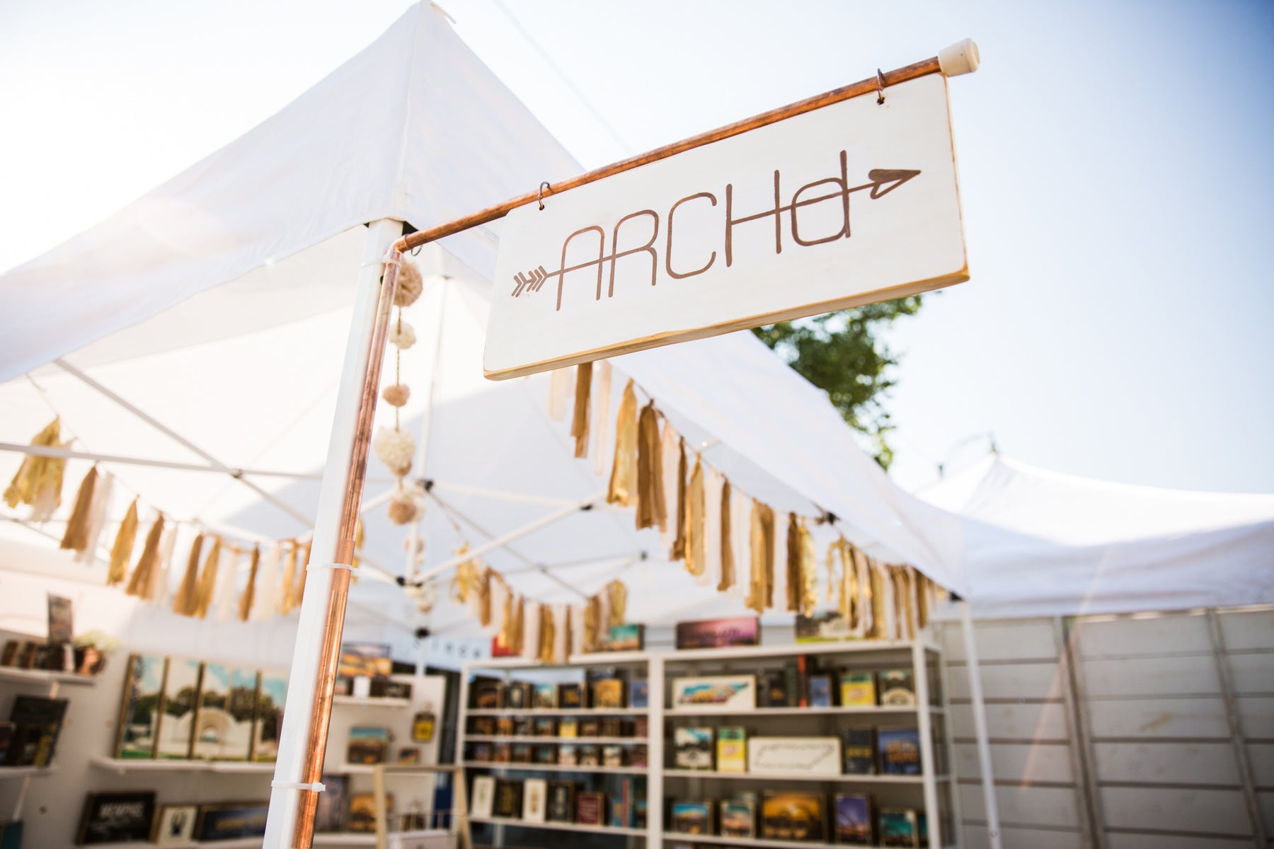
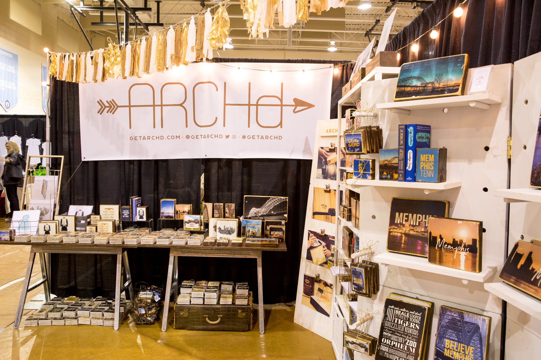
We have our friends over at Ella Jude to thank for this easy DIY pop-out booth sign idea. For this sign, we painted a thin piece of wood white, then transferred our logo (with our image transfer process) to both sides, though we've seen others hand paint their logo. We bought two pieces of copper pipe and an elbow joint and glued them all together to form an L-shaped corner. To hang the wood sign from the copper pipe, we spray-painted loose-leaf rings to match the copper pipe. We then use clear zip ties to attach the sign to our booth or tent. We're hoping to make an even larger version this year.

For additional branded signage, we bought a large white vinyl banner with grommets and designed it to include our logo, website and social media handles. We use this when we have space available. For our outdoor art shows, such as Cooper Young, we hang the banner on the back of our tent so buyers walking down the sidewalks behind the booths can see our name.
7. Tell your story with signage.
We sell handmade image transfers on wood and marble tile. The most common question we receive from customers during festivals and shows is, "Is this mod podge?" No. Image transfer is a different process that actually takes more energy and a significantly longer amount of time than mod podge. Though, our process can sometimes be hard to explain to customers. This year, we created visual aids to help explain our handmade process.
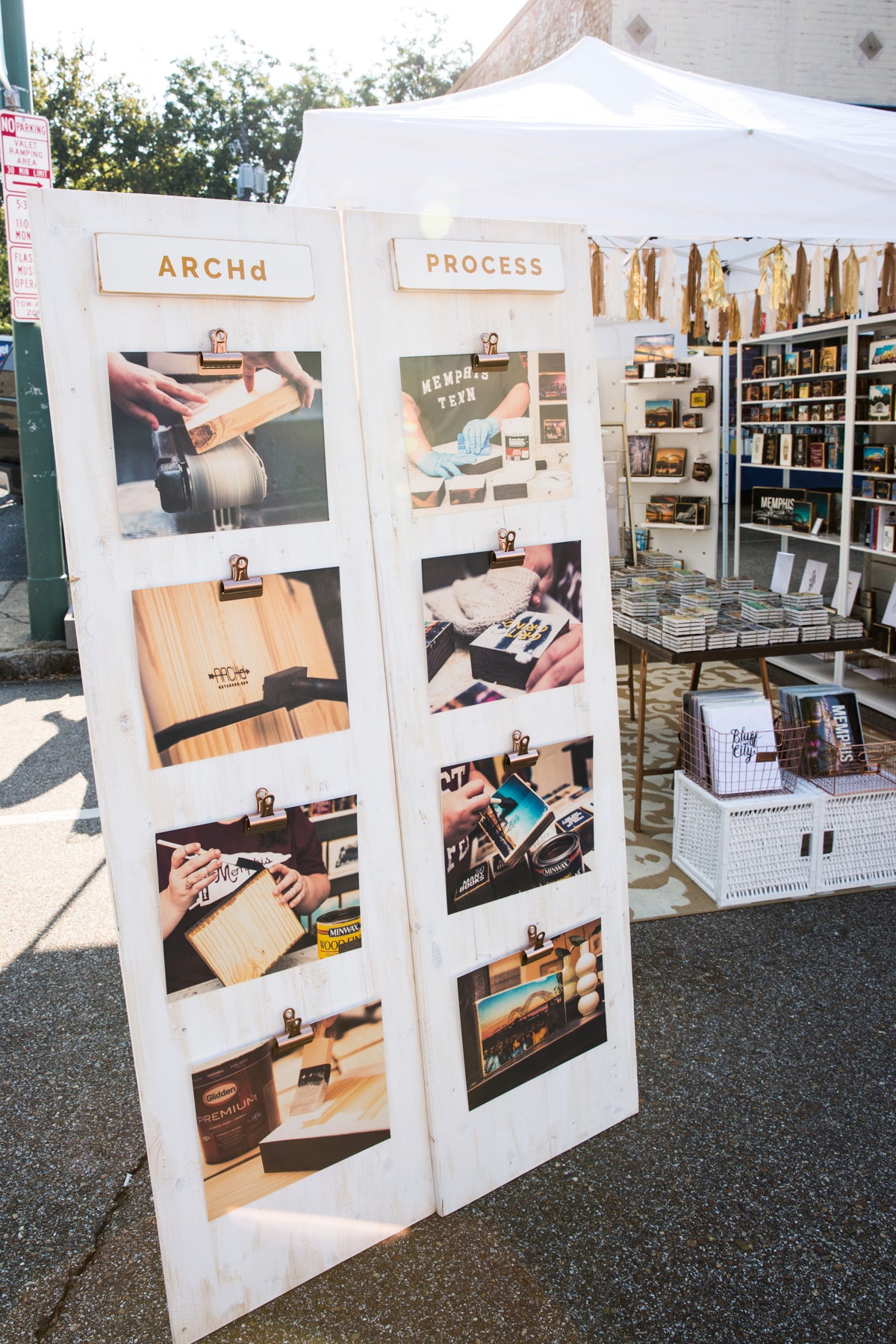
We made these "process walls" from large panels of wood bought from Lowe's. We sanded them smooth and white-washed them to match our other display walls. We added a wood leg to the back, attached with a simple hinge to allow them to stand up on their own (thanks to Sarah from Signet Sealed for this hinge idea). Kristen took photos of each key step of our handmade process and we had them printed and mounted to mat board for sturdiness. We spray-painted metal bulldog clips the same copper finish as our sign and hung them on tacks, straight down each wall. For the titles at the top, we transferred the words "ARCHd" and "PROCESS" to small wood planks and attached via velcro strips. Now, when customers ask how we make our art, we can walk them through the entire process with these images. It's much easier to follow. Plus, these large signs help with the "vertical" strategy of our booth display and serve as another eye-catcher for potential buyers walking by.
8. Price everything AND display your prices.
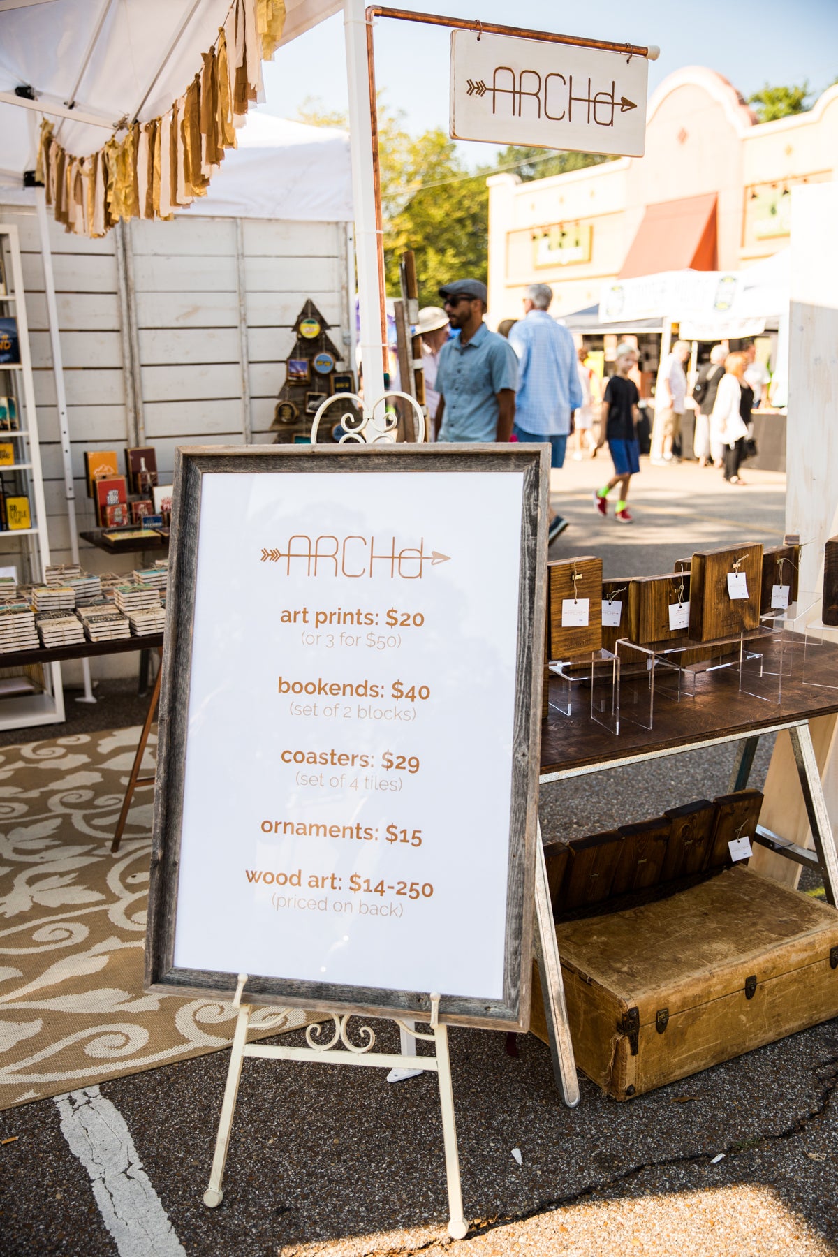
All of our items are individually priced on the back. However, that doesn't stop customers from asking how much things are. Constantly. We designed a single poster listing all of our items with pricing, framed it and displayed it on a decorative easel at the entrance of our booth. Now customers can easily see the range of prices and products we offer, all in one place.
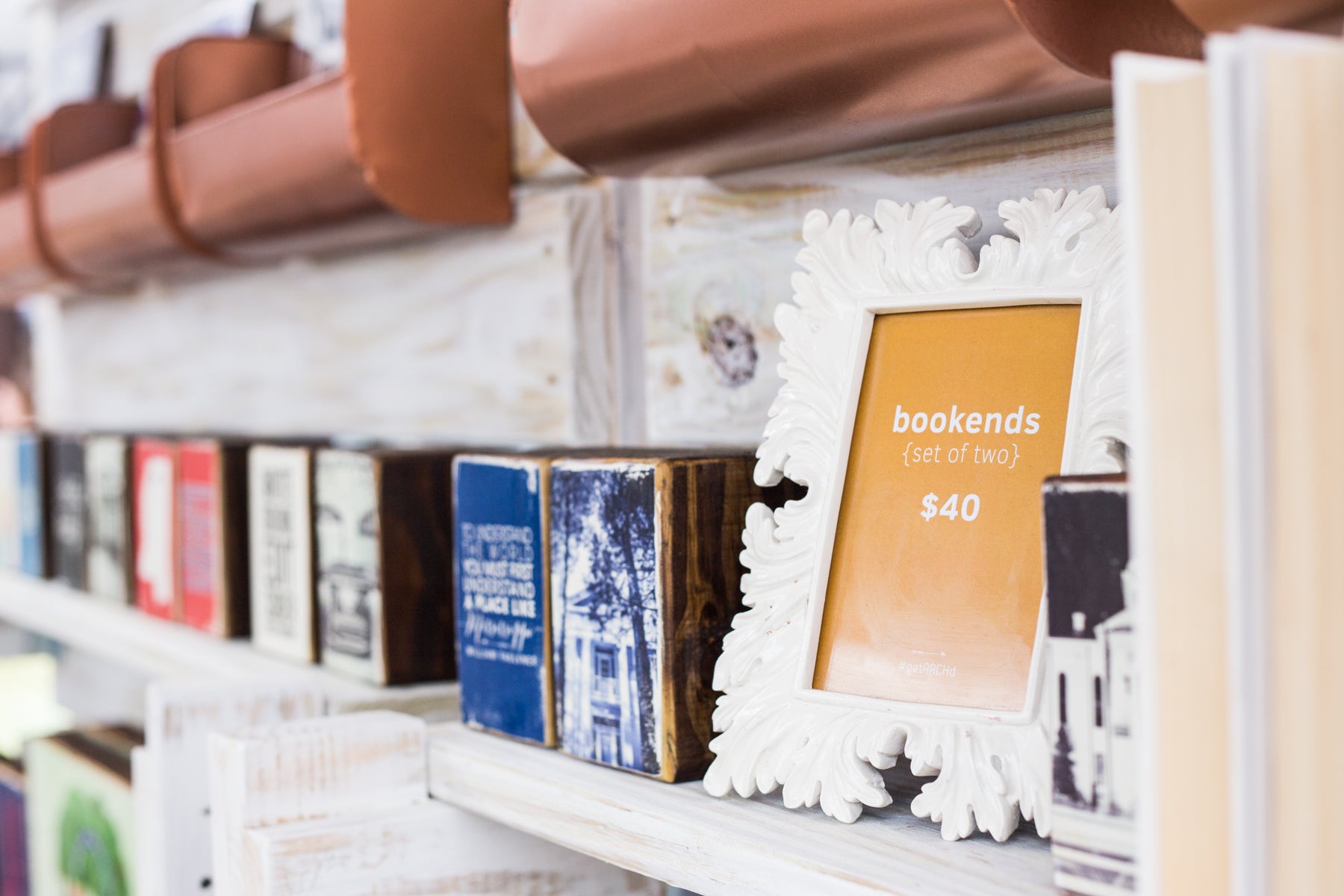
Another way to display pricing in your festival booth is with simple decorative frames near clusters of similar products. For our bookend sets, we designed pricing sheets in Adobe Illustrator with our brand colors, printed them on cardstock at FedEx Office and stuck them in a white frame we got on clearance at T.J. Maxx.
9. Some products need a little extra signage.
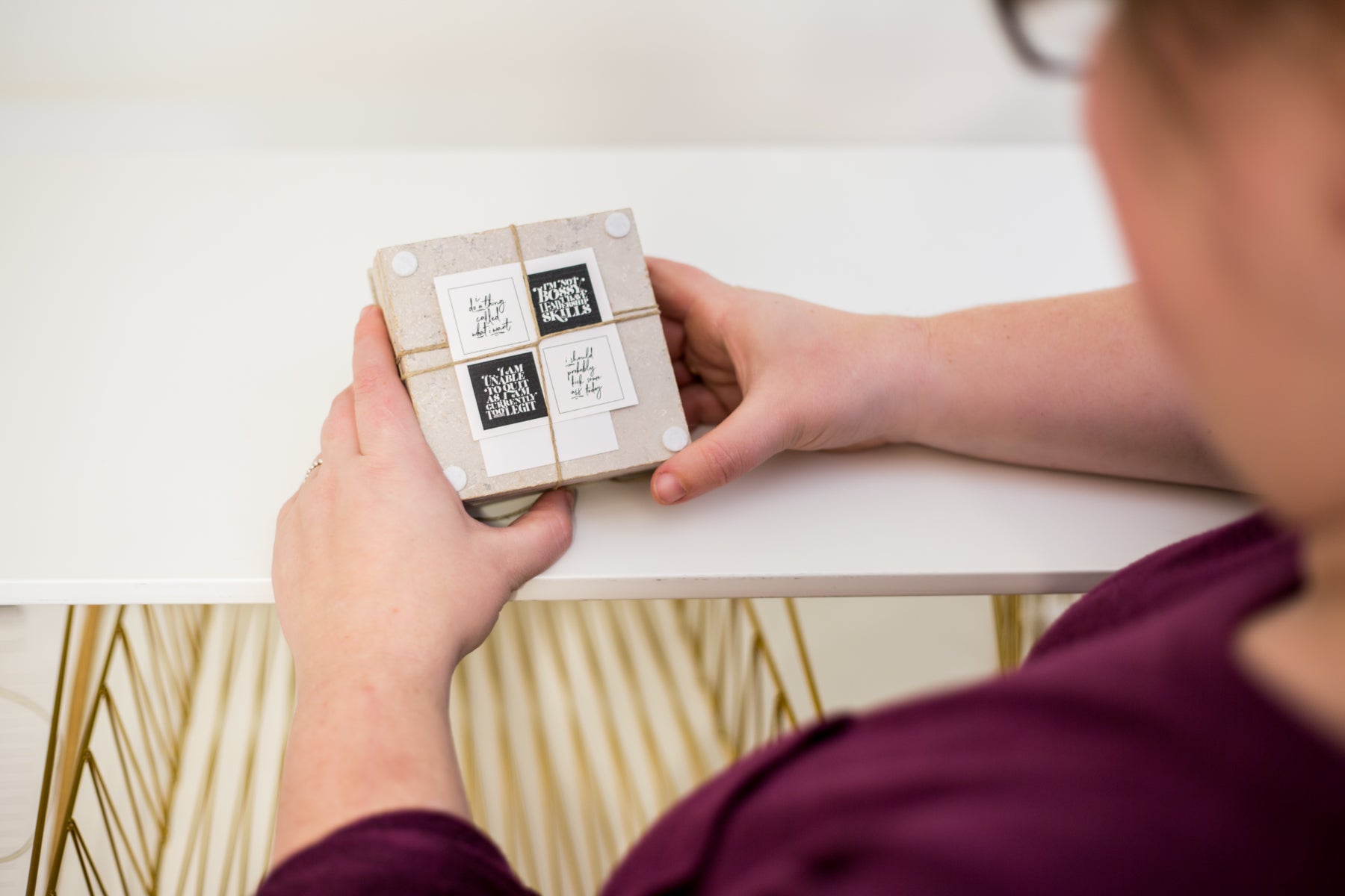
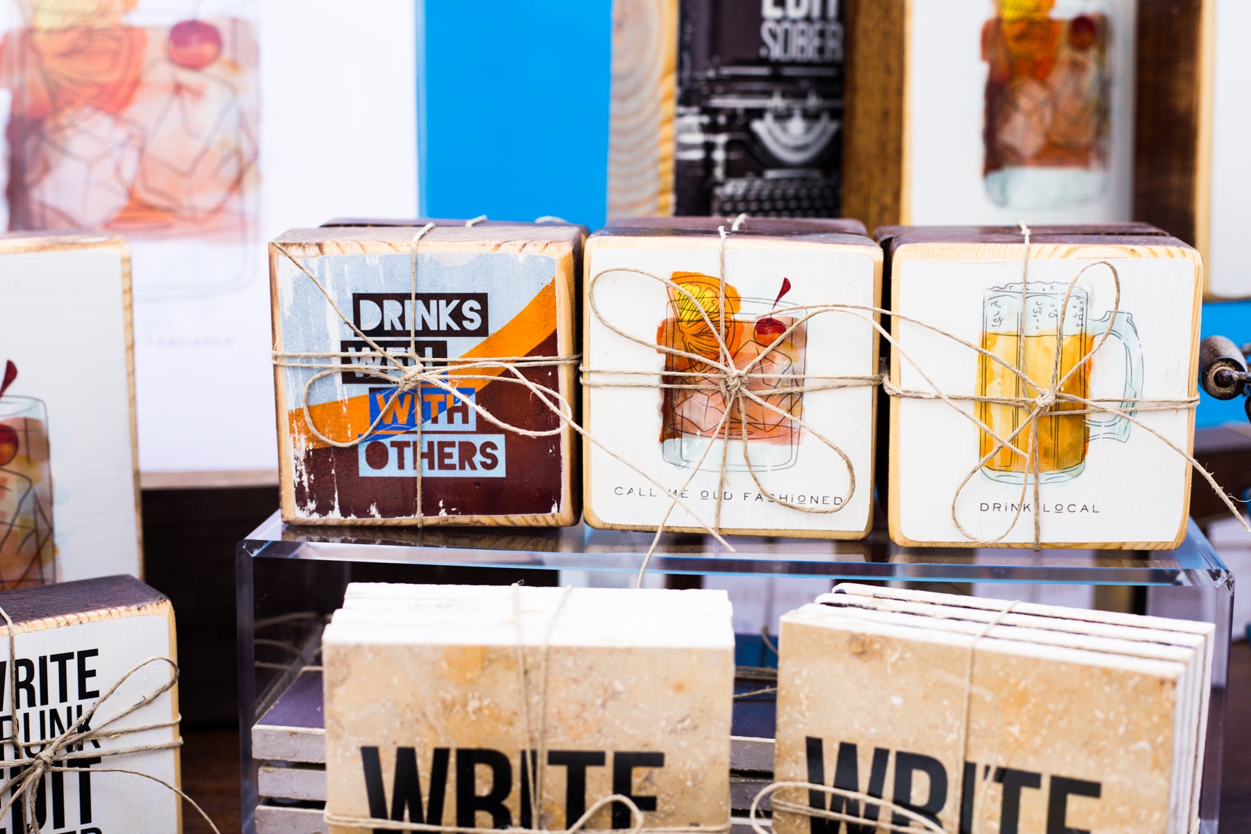
This tidbit has more to do with product packaging than simple signage. We sell marble tile coaster sets that include a different design or photo on each tile. However, for packaging purposes, we tie up our sets tightly with hemp. After the first one or two festivals or shows with customers wanting to untie all the sets to look at each tile, we started printing the full set on a piece of cardstock and sticking the sheet under the hemp on the back. Now, customers can simply pick up a coaster bundle and turn it over to view what's included in each full set. So, if you happen to sell multi-packs of an item—be it coasters, art prints, notecards, etc.—include a backer sheet with the full set for a little less of a headache.
10. Decorate your vendor booth space.
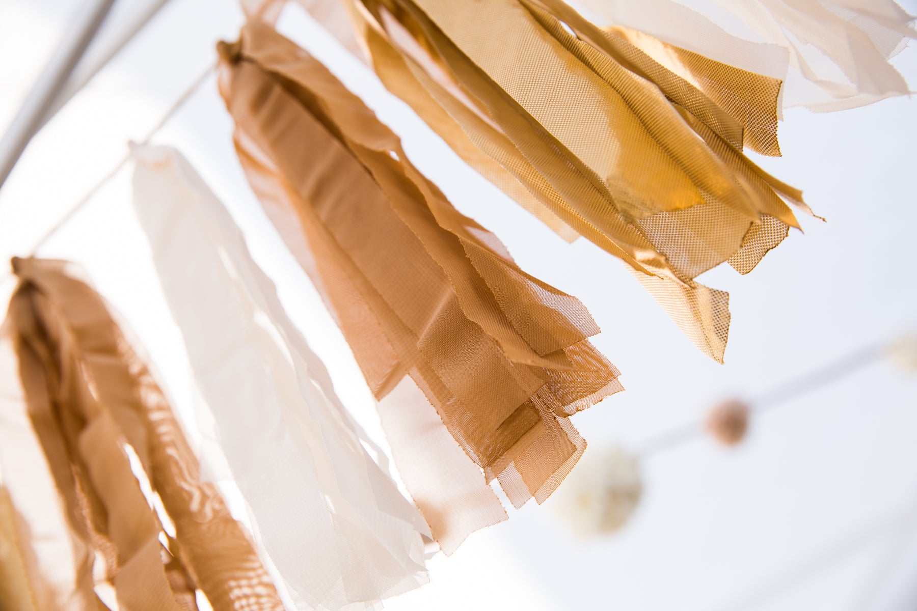
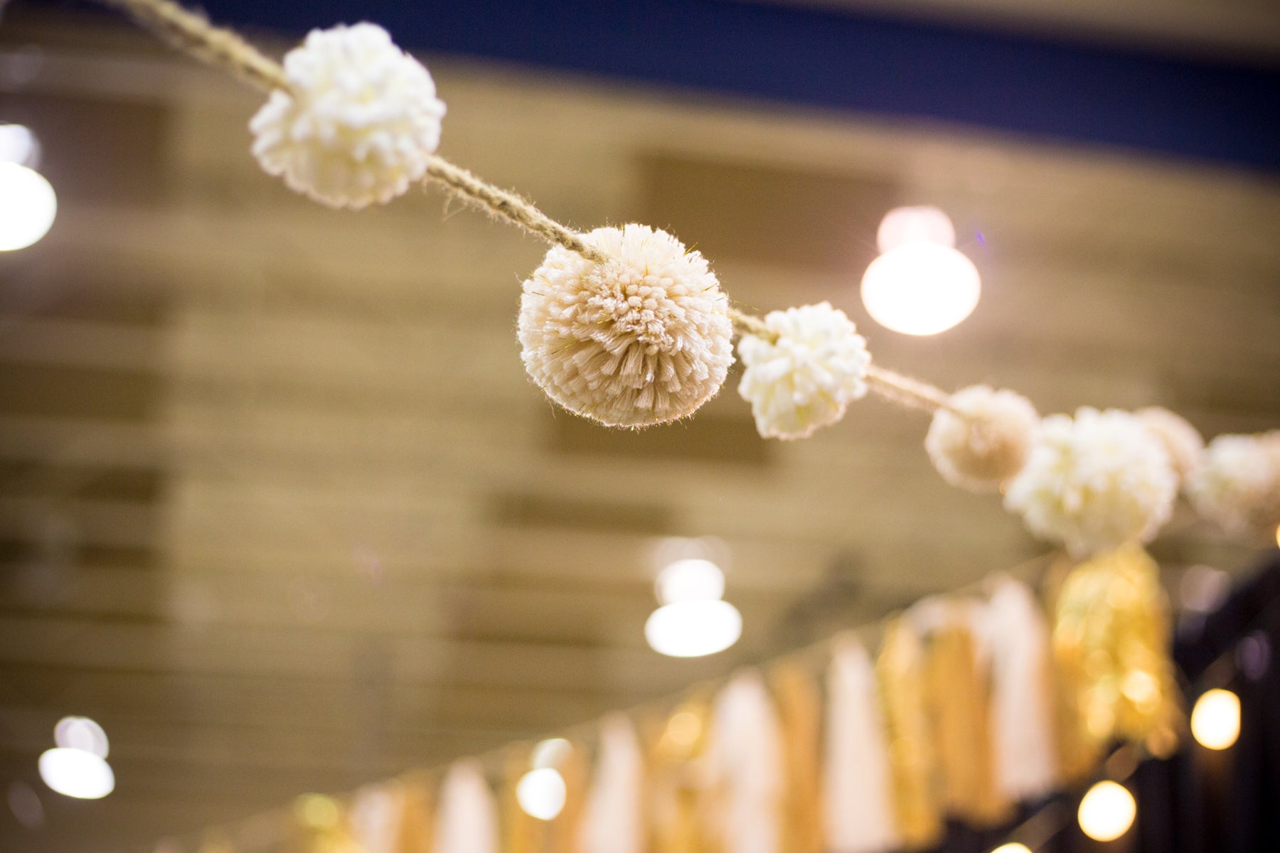
For us, it's all in the details. We like to use the term shabby chic when describing our ideal vendor booth atmosphere. We want our space to be fun and inviting. For us, garland does the trick. It's easy to hang from the inside of our tent, as well as light enough to string between pipe and drape at indoor shows. While there are a ton of DIY Pinterest posts on how to make your own garland, we went the easy route and bought white/gold fabric garland and pom pom garland from the seasonal section of our local At Home.
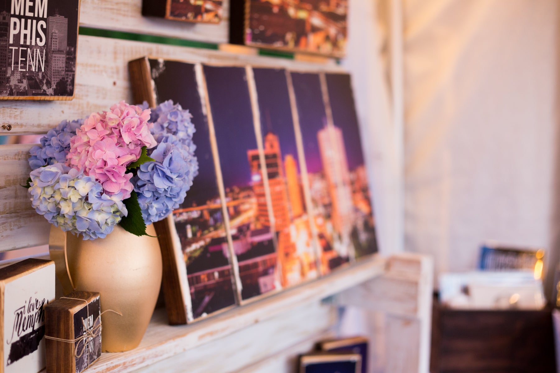
For some shows, we'll add vases of fresh flowers. It helps give our booth that "homey" feel.
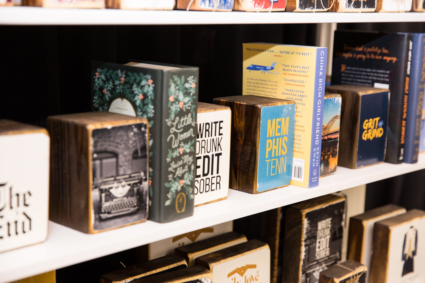
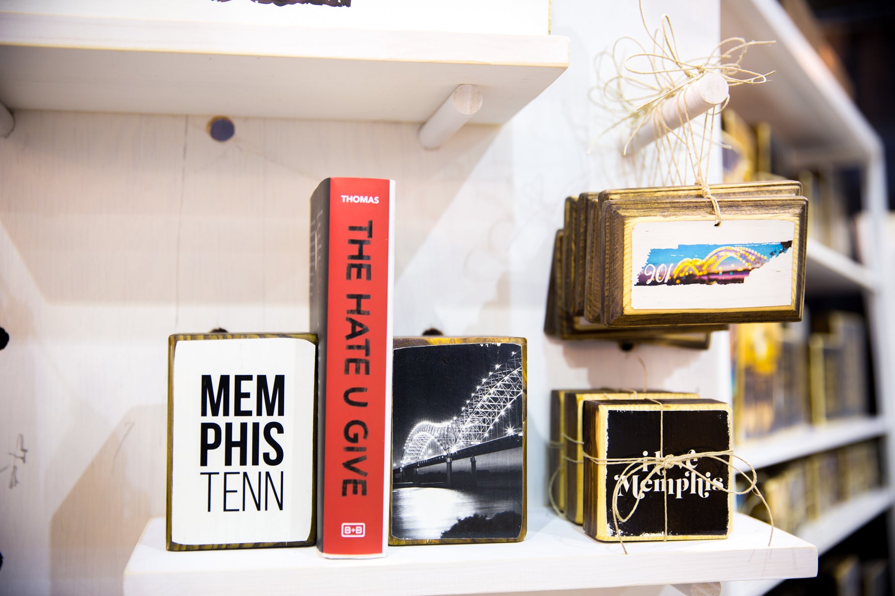
Room permitting, props can help enhance your vendor booth. To display our wood bookends, we bring stacks of books from home and place a few between each set. The more you can demonstrate how your products will actually be used, the easier for the buyer to picture your work in their home. Plus, the books are just pretty. And through all our shows, markets and festivals, we've only had one customer actually ask if the prop books are for sale. No. Definitely not for sale.
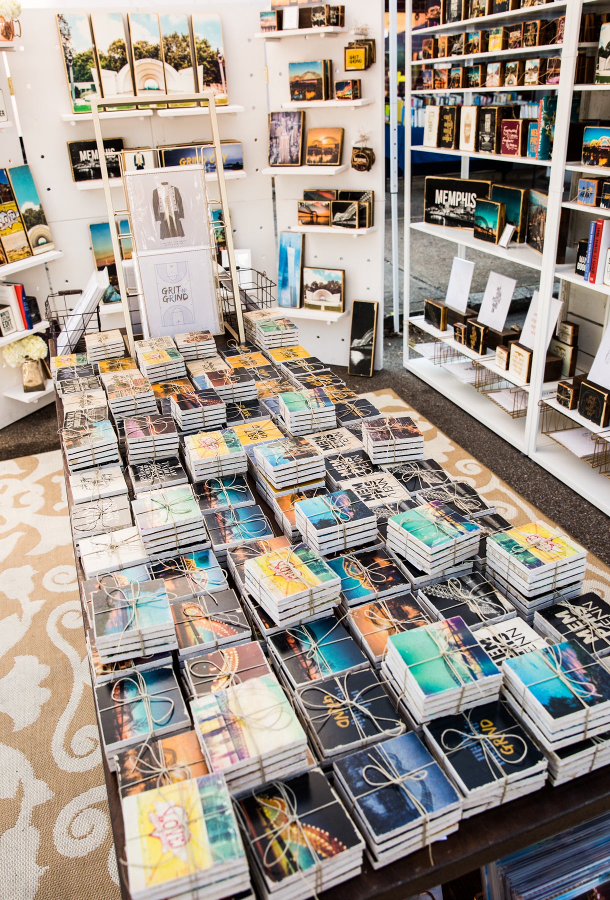
At outdoor shows, we try to always include an outdoor area rug in the main portion of our vendor booth. It can help even out rough gravel spots, as well as contribute again to that "homey" feel.
LAST UP IS OUR MOST IMPORTANT TOPIC: BRANDING.
Coming from a graphic design background, I cannot stress enough the importance of good design and brand recognition. When customers visit our vendor booth at an art festival or market, we want them to walk away knowing our name, how to get in touch with us after a show, where to buy our product locally, how to connect with us via social media ... and the list goes on and on. We basically want to hit them over head with our brand. Again and again and again. As much as possible. Here are a few ways we achieve this.
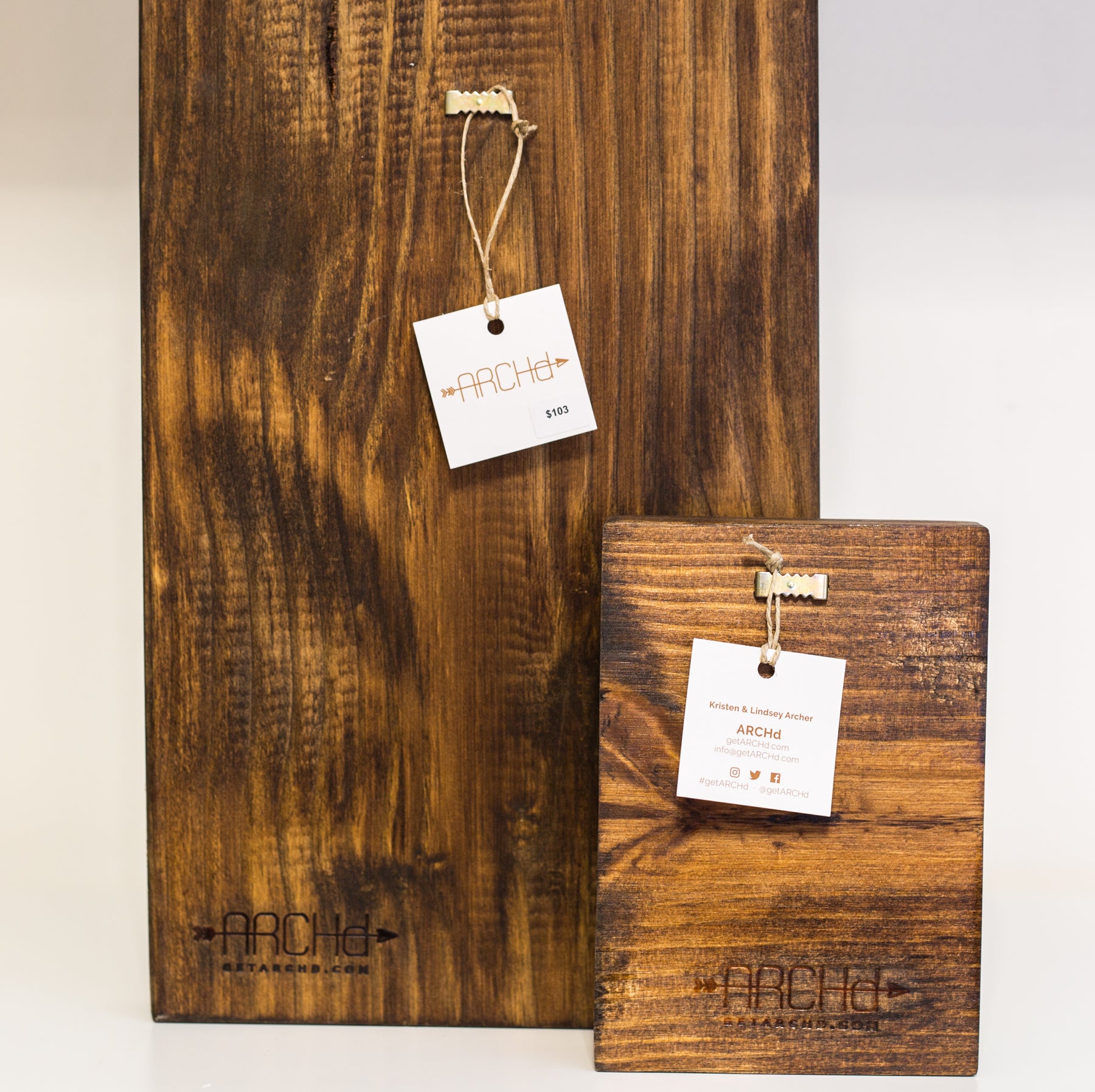
11. Let your business cards serve double duty as price tags.
Instead of using blank price tags, we punch a hole in our business cards and string them on the back of every piece of wood art. We design them as a smaller square, just for this purpose. We print sticker labels with prices, which we then stick on the business cards. This means every buyer is walking away with at least one of our business cards.
12. Include extra business cards and freebies at your check out station.
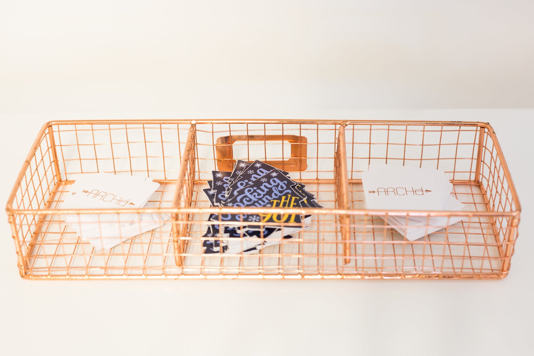
As a vendor at our first art festival, we completely underestimated how many visitors would want to walk away with our business card. Since then, we try to come over-prepared. We'd rather have too many business cards than run out halfway through a show. We also stick them in every shopping bag.
Another idea we've started doing for every show: free stickers. Why? People. LOVE. Stickers. Especially free stickers. We create a design and buy a large quantity to last us through a season. When a potential buyer walks by and you hand them out something free, they are more likely to stop and browse your booth. Why? People. LOVE. Free things. We also always incorporate our website in the design, making it a pretty inexpensive marketing tool. We get ours from Sticker Mule.
13. Always come with some form of marketing materials, other than business cards.
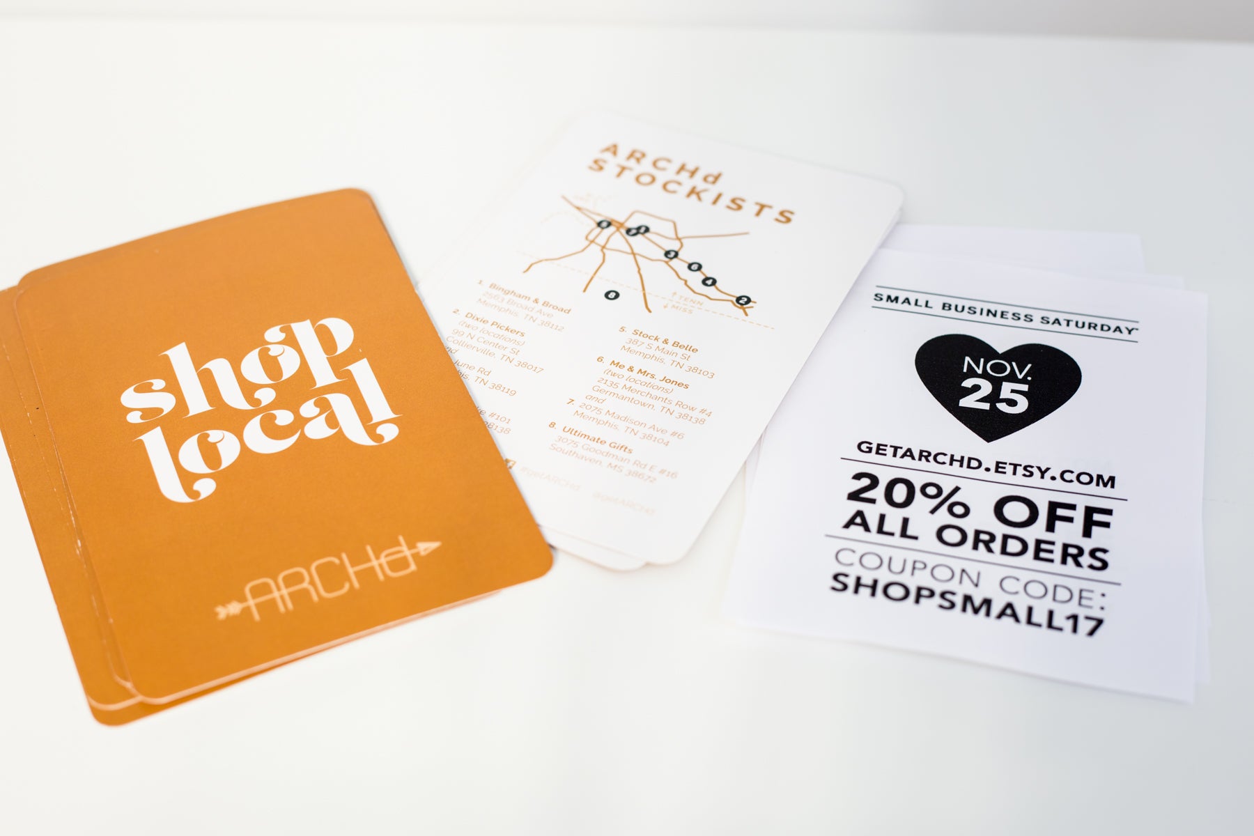
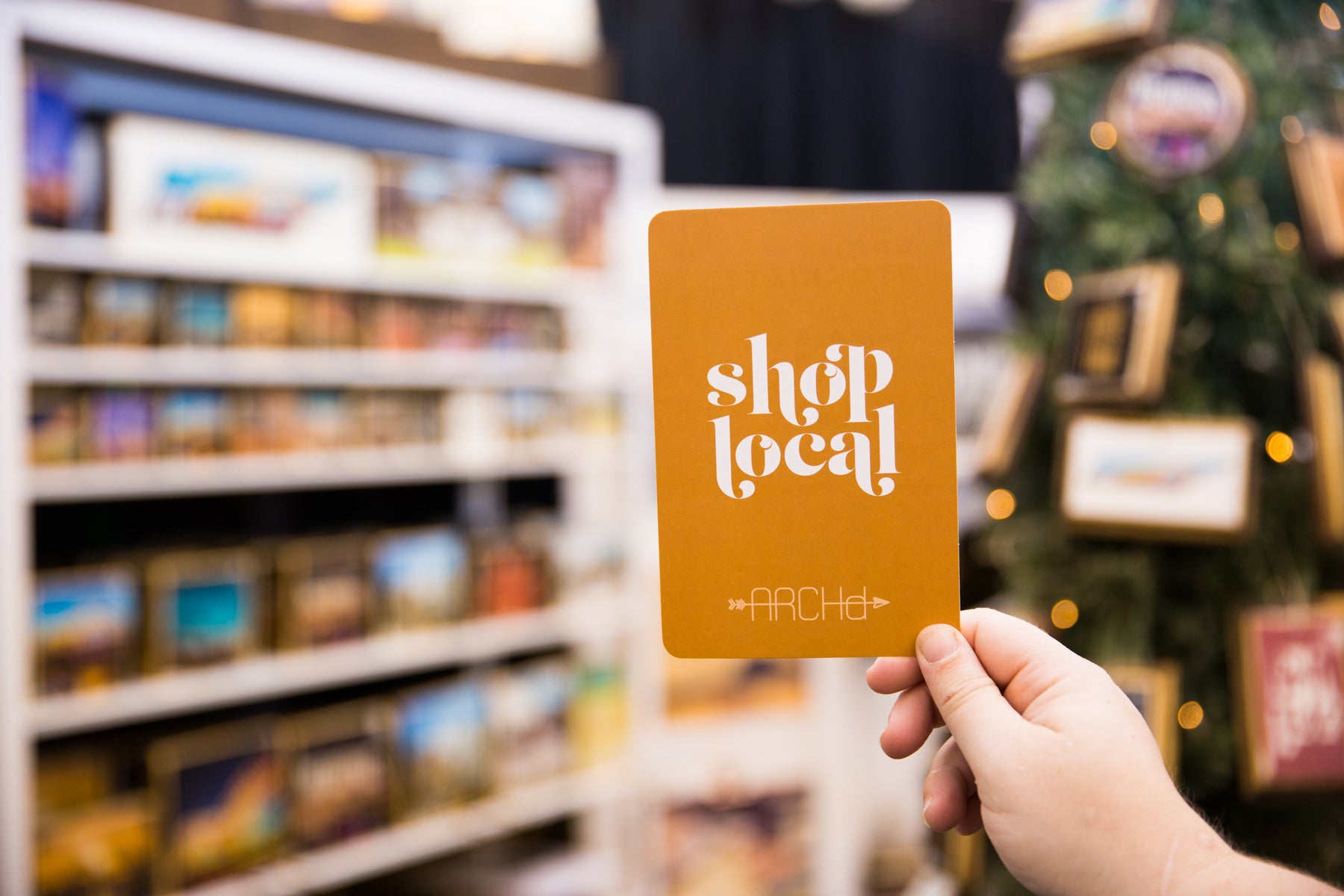
Marketing materials are great opportunities to reinforce your brand. They can offer a connection to a buyer after he or she leaves the festival or market. We stuff every customer's bag with a business card, a free sticker and at least one other piece of marketing collateral. For our local art festivals this year, we designed a "shop local" postcard which included a full list and map of the places customers could find our products around the city. When you inevitably receive that super common question about where you are located or if you sell anywhere local, you can present the postcard. We also try to include a flyer with any upcoming promotions or events, such as the Small Business Saturday coupon example below. These serve as a call to action and encourage repeat customers.
14. Bring shopping bags for customers to carry away their purchases and BRAND them.
Bags are a MUST. I repeat. Always bring bags in which your customers can carry away their purchases. Plus, you can ensure they receive your marketing materials by pre-stuffing them in all the shopping bags. Also, bags are another chance for you to highlight your brand. Purchase a rubber stamp with your logo and/or website, buy a stamp pad that matches your brand and voila! Branded merchandise bags. We use white kraft paper bags and purchased our stamp from Best Rubber Stamp, a local Memphis company. Super affordable and totally worth it.

15. Establish a way for your customers to connect with you after an art festival or market.
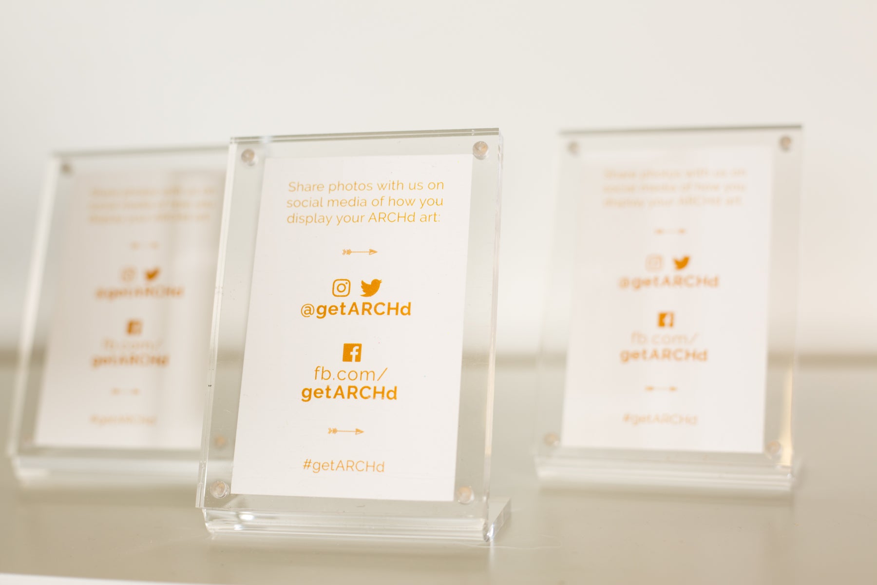
In addition to the coupons and flyers we hand out at markets, we try our best to promote our social media and email list as a way to connect with our customers after shows. We bought these cute Instax clear magnetic frames from Urban Outfitters (that are no longer available) and designed little flyers for them with our social media handles. Then, we placed them around our vendor booth for customers to see while they shopped.
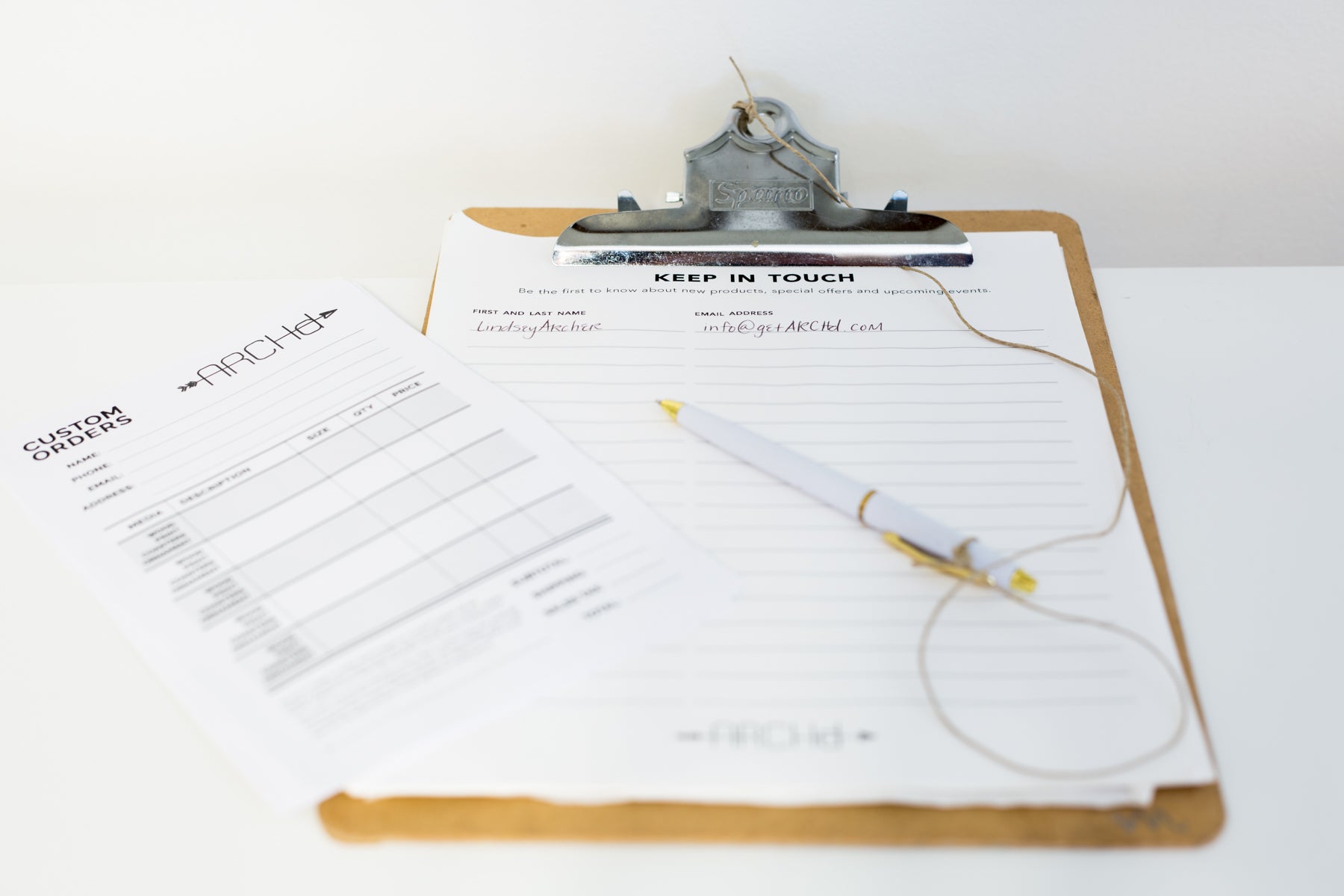
We also include a clipboard at our check out station for visitors to add their name and email address to our email list.
AND FINALLY, ONE LAST BONUS TIP:
16. Offer and/or upsell custom orders.
We often see customers early on in a show who are browsing and not yet ready to buy. Then they come back later and the item they wanted is sold out. While we stress to visitors that our inventory is limited, some potential buyers want to browse the entire show or market before settling on a purchase. For this, we always bring branded custom order sheets, so we are prepared to take the order and keep it organized. We designed them in Adobe Illustrator with a spot for them to write their name and contact information (email address and phone number, just in case), as well as a grid for the possible items they could purchase. We offer local pick-up in Memphis, or the option to ship directly. And we're always sure to include fine print for when buyers can expect their item to be ready, along with a spot for them to sign (see a sample custom order form above).
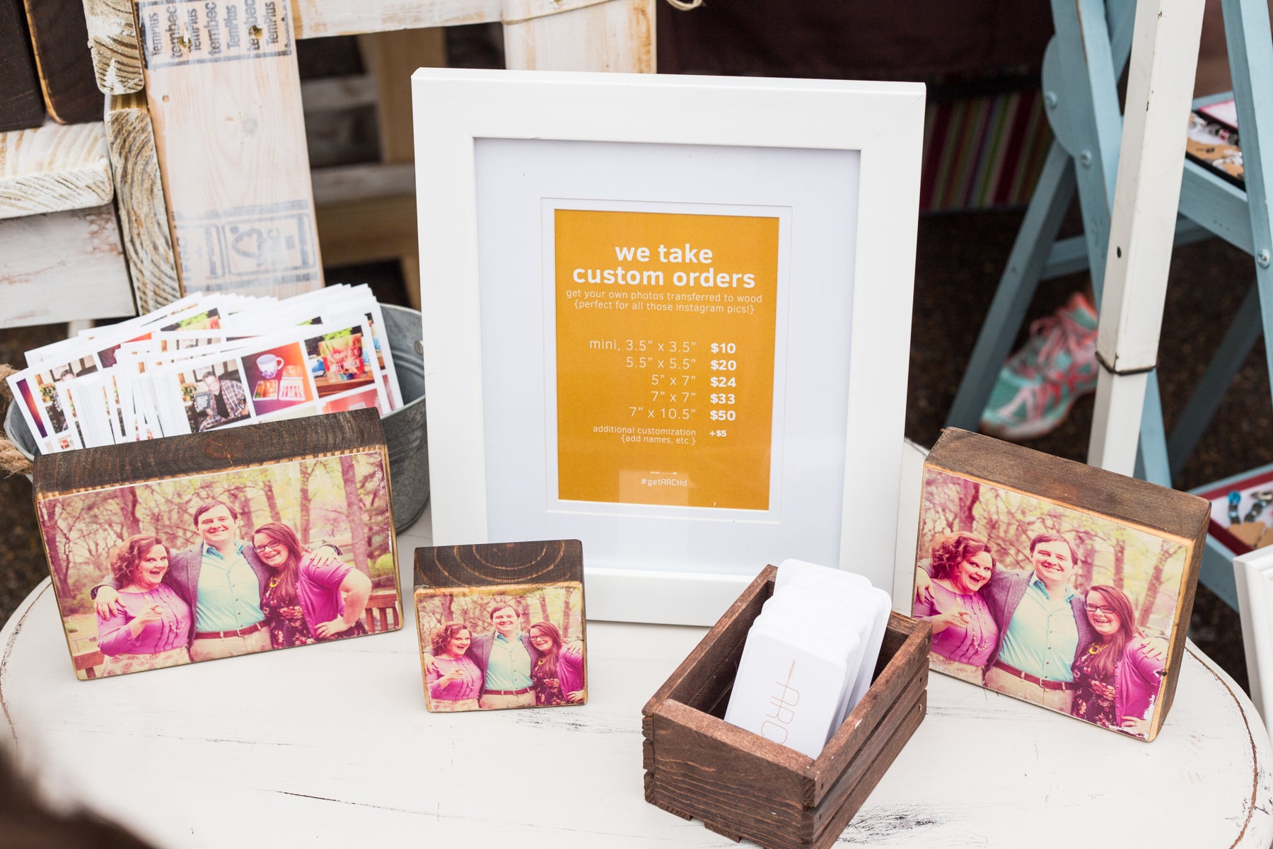
Another custom order we offer is the option to take a customer's own personal photo and transfer it to our wood art. While custom orders aren't a huge percentage of our event sales, our goal is to at least inform visitors to our booth about the service. To do this, we try to have a small table next to our check out station with custom photo examples, which we can talk about while we ring up their purchases.
We hope you've enjoyed these vendor booth tips and ideas for selling at art festivals, craft fairs and indie markets. Have questions or in the market for some design help? Feel free to email us at info (at) getarchd (dot) com.
Good luck and happy vending!
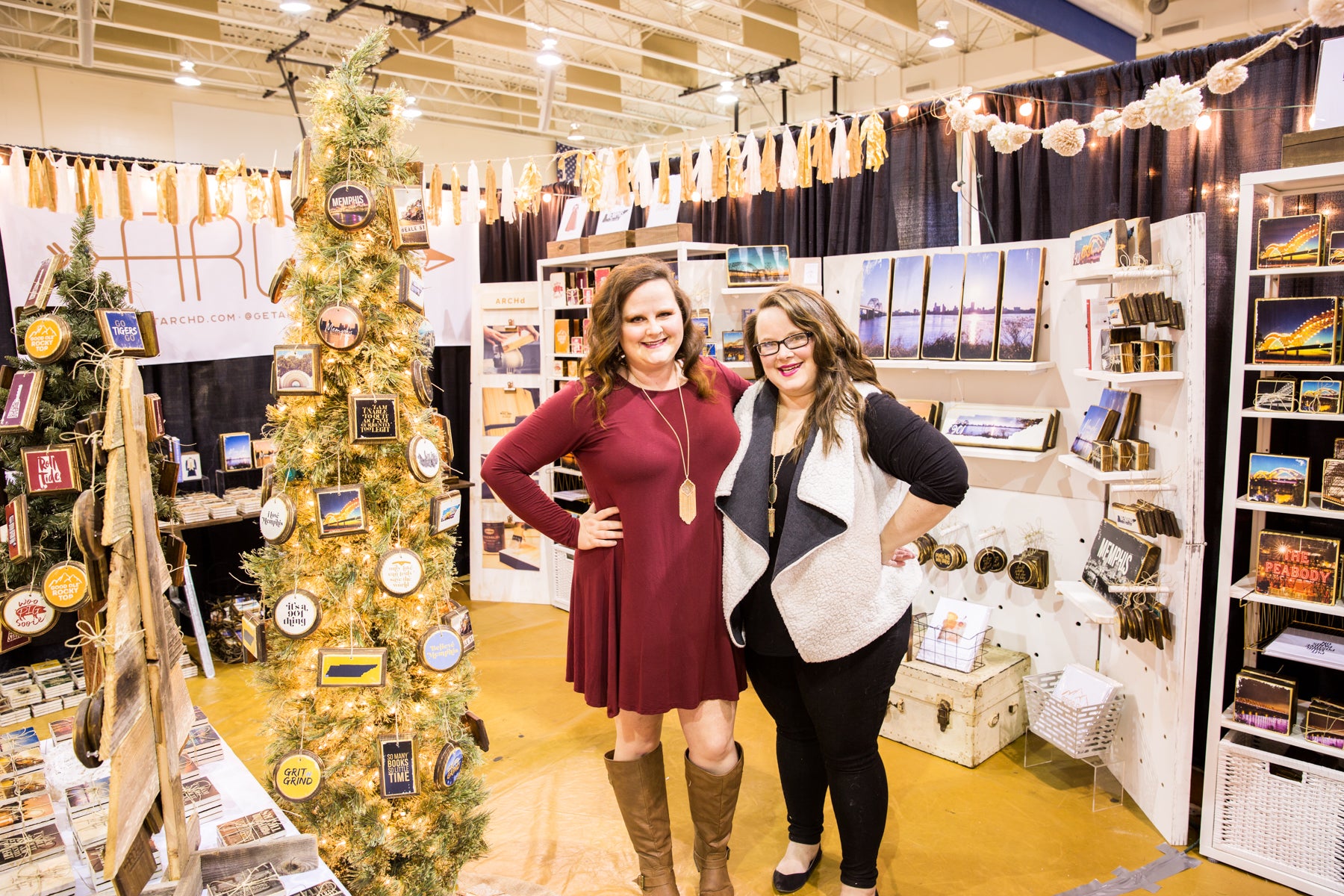
- Kristen and Lindsey Archer


Thank you for this tips! Much needed and will apply MOST if not ALL ideas for my farmers market!
THANK YOU!!! I am a printmaker and live in Wisconsin. I am praying I can find a way to incorporate so many of these ideas!! I need all the help I can get as this is my first season… I Weill be looking for more ideas from you!
This is probably the best article I have found with vendor booth tips!!! I will go into my 1st spring market next month and will def be using these ideas!! Thank you soooo much!!
This was so incredible! All of these tips were so so helpful and i’m feeling a lot more confident going into my first summer of farmers markets!
Thank you for all of these fabulous ideas! I hope to be out on the circuit this time next year!
Wondering what hanging sign size you want to have? Could you share the dimensions of your ideal sign?
Leave a comment